Introduction and Learning Objectives
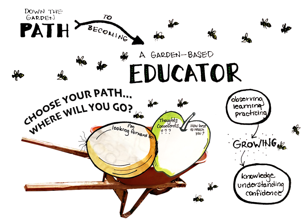
This image introduces the path to becoming a garden educator at IslandWood and beyond.
Learning Objective:
The learning objective is about the path one will go down in becoming a garden educater. The page will become interactive offering links to other pages of the website.
Original File Links & Licensing
Ps - Photoshop
Ai - Illustrator
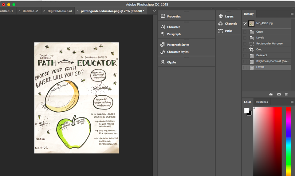
My first original image source is a photo I took of a worksheet that was designed by the Garden Educators at IslandWood. Here is the original photo I took of the front page of the worksheet.

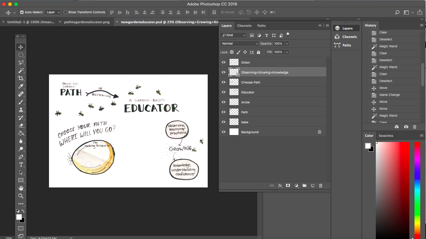
The second original image source is a photo of a wheelbarrel that was taken in the IslandWood garden.

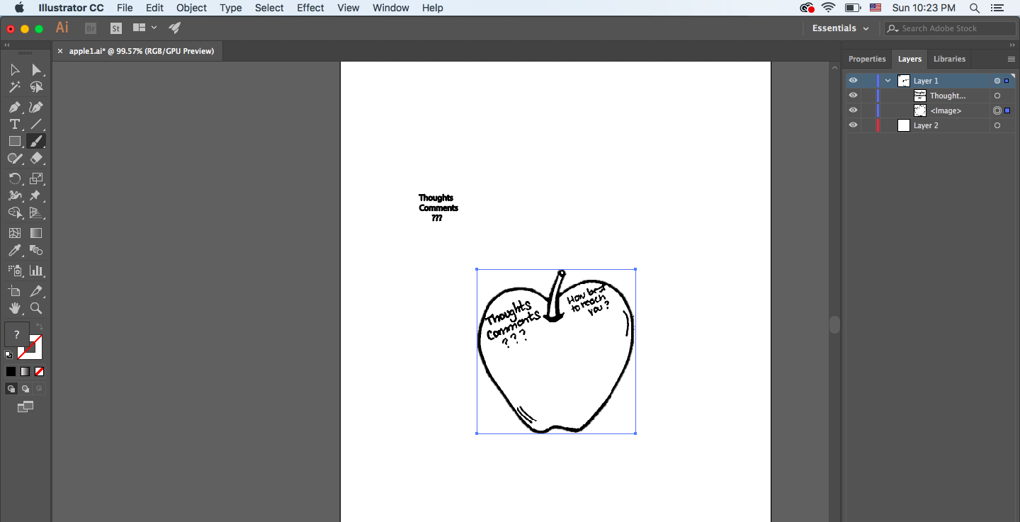
After importing the worksheet image into photoshop, I used mutilple photoshop techniques to enhance the photo. I then used cropping tools to cut out sections of the worksheet and then I reconstructed and designed the new digital image.
The new digital image contains several design techniques that are listed in the next section.
Techniques:
Basic Raster:
Advanced Raster:
Basic Vector:
- Cropped Image
- Rotated Image
- Transformed artwork
- added a line of text
- Formatted Text
- skewed text
- Cut and erased artwork
Advanced Vector:
- Recolored artwork
- Reshaped Text
- Drawed with the pencil tool
- Joined artwork together
- Edited shapes
- arched text
Design Elements:
Contrast
The colors were brightend to enhance the contrast of the images and the text. Contrast of the images and the text are clear and standout from the white background. The color on the images in the wheelbarrel were also enhanced to give attention to them as the main objects on the page.
Repetition
Repetition is seen in the use of the visual graphics that give the page an organic flow. The bees were repetively used so they look like they are flying across the page. Repetition can also been seen directly with the use of the arrows. The arrows keep pointing to the next section of information.
Alignment
Alignment is seen in the overall flow of the elements on the page. The audience can follow the action of the page by following along with the arrows that point to the next information. Reflecting back to the image now, I think I'm going to flip the direction of the bees so that they are heading in the same direction as the arrows which will help the alignment.
Proximity
Proximity is seen in the pacement of the text near images and arrows. The arrows help keep the flow of direction moving one-way. The vegatables are kept in close proximity using the wheelbarrel which helps keep the main focus on them.